Info & Services

Typographic Logo
We start by discussing the project, which often leads to an extensive process of various experiments. I tend to create something truly unique while still maintaining a message that aligns with the brand's needs.
Send me a message >
Custom Typeface
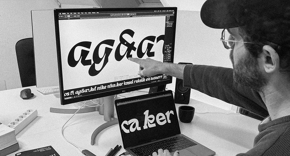
Want to really stand out? Or do you need a custom typeable typeface for your window display, vinyl record, posters, or visual identity? This service provides a well-drawn typeface tailored to your needs, ranging from a basic character set to fully supported Latin language files.
Send me a message ︎
About
Peter Roeleveld is a typedesigner who has grown up in the field of graphic design. His typographic works are most commonly published as typefaces, where he aims to embody unique concepts within the shapes of his letters. These concepts typically reflect specific events or interests in his life. 'If I didn't work at a stonemasonry, a typeface of mine wouldn't came to existence because it resembles an interest I've developed in the stone material at the time being.
Striving to deliver works that is not always digital based, but also explored on physical materials as well. Peter is no stranger to exploring a wide variety of themes within his typographic works, whether it's traditional type on paper or experimental typography where rules can be broken..
Contact
Graphics.Roeleveld@gmail.com
+ 31 (0)6 22628674
Catherijnsingel 52
3511 GC Utrecht The Netherlands
Socials
Exhibitions & Publications
2024: Kargadoor Utrecht
2023: Exposure HKU 2023
2023: Slanted Experimental type2.0
2020: ABRI Acedemie Galerie, Utrecht, NL
2020: New Aesthethic Vol 2.
Articles
Type01: Experimenting with Uniqueness and Legibility + Exploring Alter-egos Through Design | A Catch Up with Peter Roeleveld
People of Print: Introduction to Peter Roeleveld
HKU: Winners of the Utrecht Jaarbeurs Poster contest
Cargo.site: Blog 199/Sites in use
ItsNiceThat: How to design a carvable typeface fit for a headstone with Peter Roeleveld
©All Rights Reserved 2025
Site designed with Cargo.site︎︎︎
End-User License Agreement
This an End-User License Agreement (EULA) between you (the end-user) and Peter Roeleveld. Please read this agreement carefully. By buying and/or installing the font, you are agreeing in the terms of this license.
General — The purchase of 1 license grants up tp 3 users, of a single organisation, the right to use a copy of the Font software. Copies may be made for archival purposes. This software is copyrighted and contains intellectual property information protected by law. You are not allowed to reproduce, sell, transfer, license, give away or otherwise distribute the Font Software in any form. In this current EULA, Roeleveld does not offer more than 1 license.
Embedding — Embedding of Font Software into documents or internet pages is permitted using any technique, including @font-face, under the following conditions:
A. You must use the webfonts provided in your package. Linking to the full OpenType font designed for desktop installation is prohibited.
B. The webfont may only be installed on website domains that are under control of the licensee. If this is not the case, then it shall be counted as an additional use.
Modifcation — You are allowed to modify the Font Software for personal and business user under the following conditions:
A. You may not distribute, reproduce, sell, transfer, license, or give away your adaptations without the written constent of Peter Roeleveld.
B. Each user that has access to the modified Font Software shall still count as one of your permitted number of users.
C. You may not make, authorize or comission a third party to make, customized versions of the Font Software for user by your clients without the written consent of Peter Roeleveld. Alterations to outlines for the use of logos and design elements are not considered to be a modification of Font Software and are permitted.
.
Termination — Peter Roeleveld has the right to terminate your license immediately if you fail to comply with any terms of this Agreement. Upon termination you must destroy the original and any copies of the Font Software and documentation.
Updates — Peter Roeleveld agrees to provide licensees with free updates as the development of the Font Software progresses. The maker may discontinue work on Font Software at any time for any reason. This agreement shall remain in effect regardless of the future plans for the Font Software.
Warranty and disclaimer
A.The Font Software is a work in progress and is sold as is. Licensee acknowledges that there may be bugs and/or flaws in the font software.
B.The Font Software is delivered “as is” without warranty of any kind. The maker of this Font Software is NOT liable for any damage (physical, financial or other) resulting from the use of the Font Software as well as consequences of any kind resulting from the dealings with the Font Software