︎
Peter Roeleveld
Info & Services
Studio works
Bastiro.otf
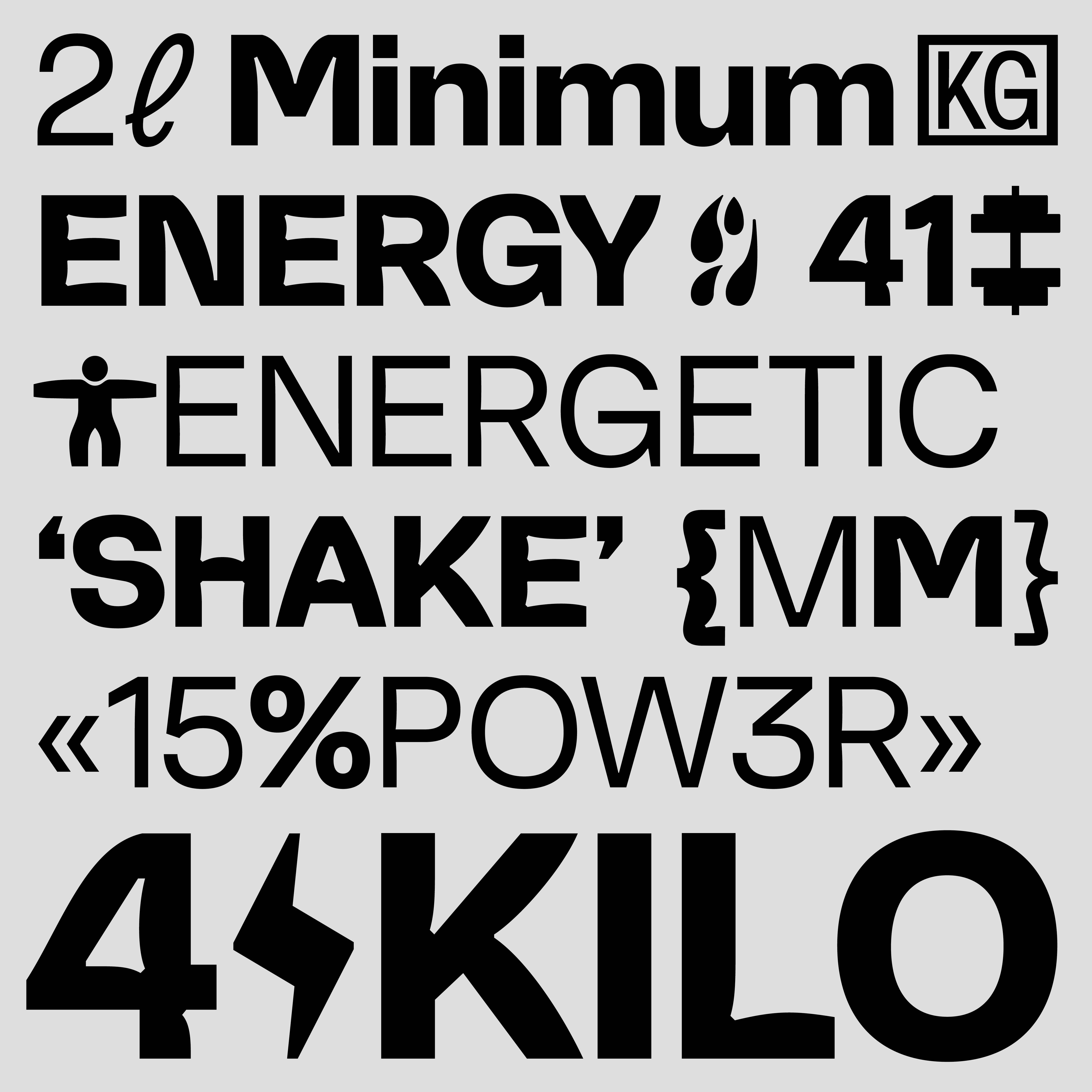
Hypermono.otf
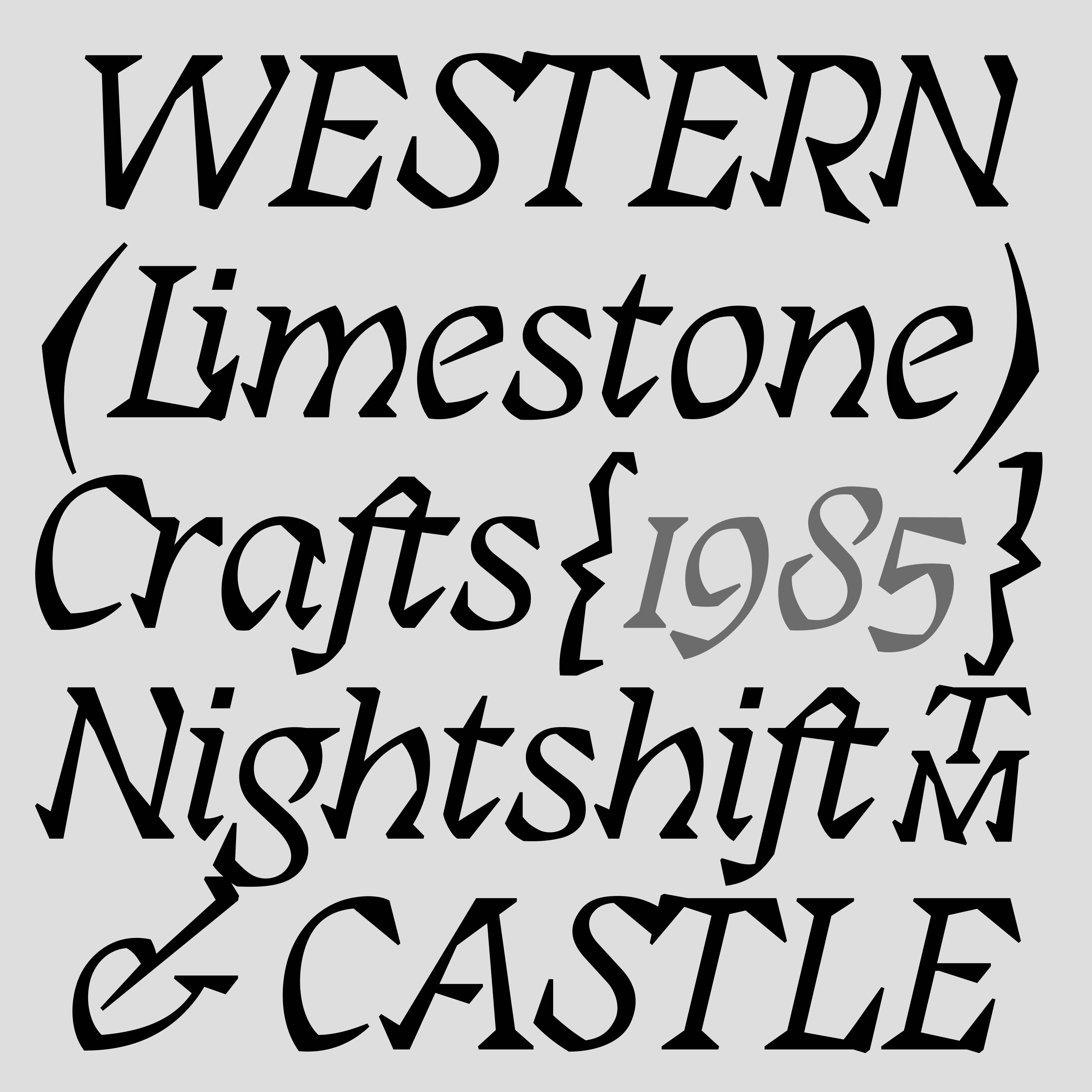
Facade.otf
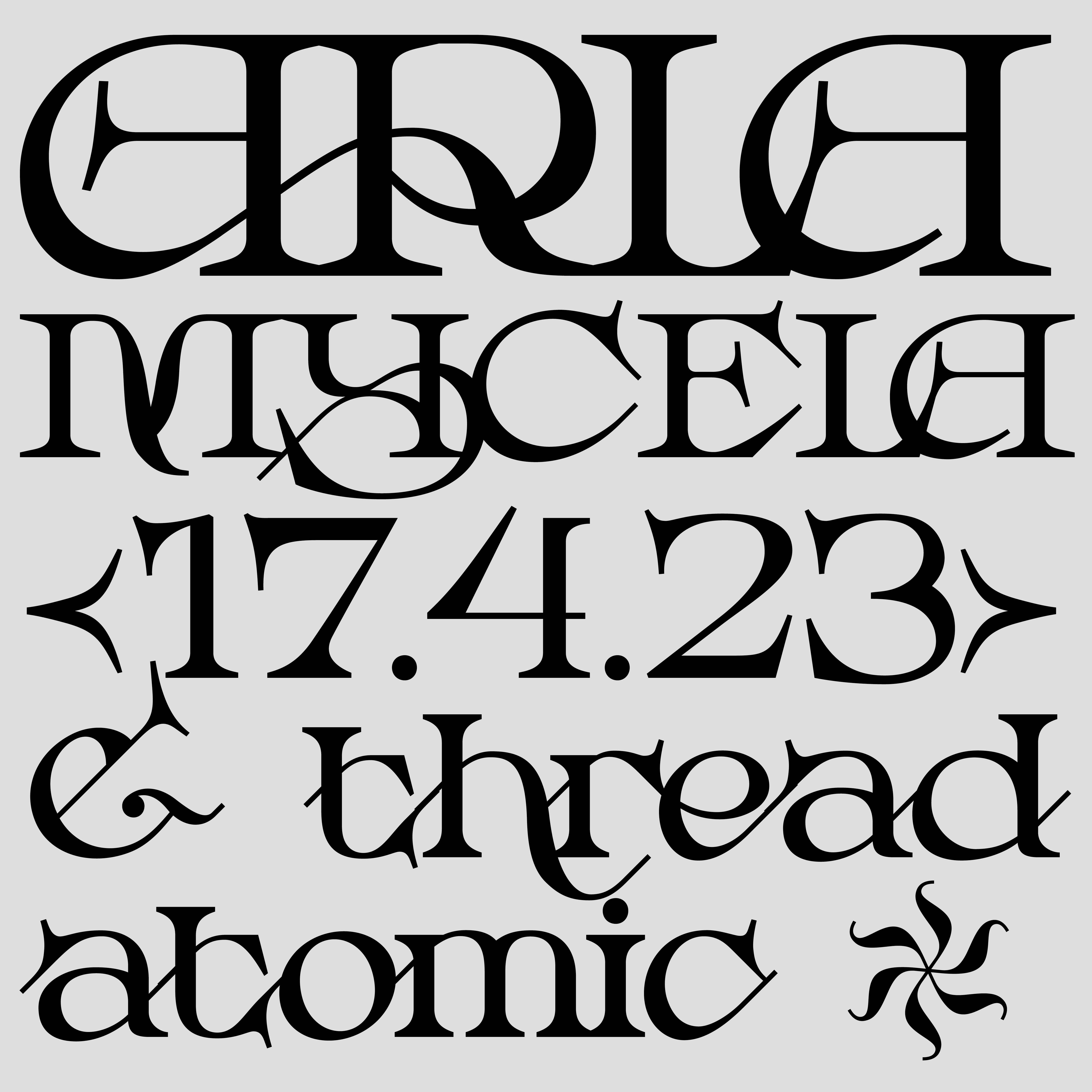
Muscular.otf
Hackon.otf
Saku.otf
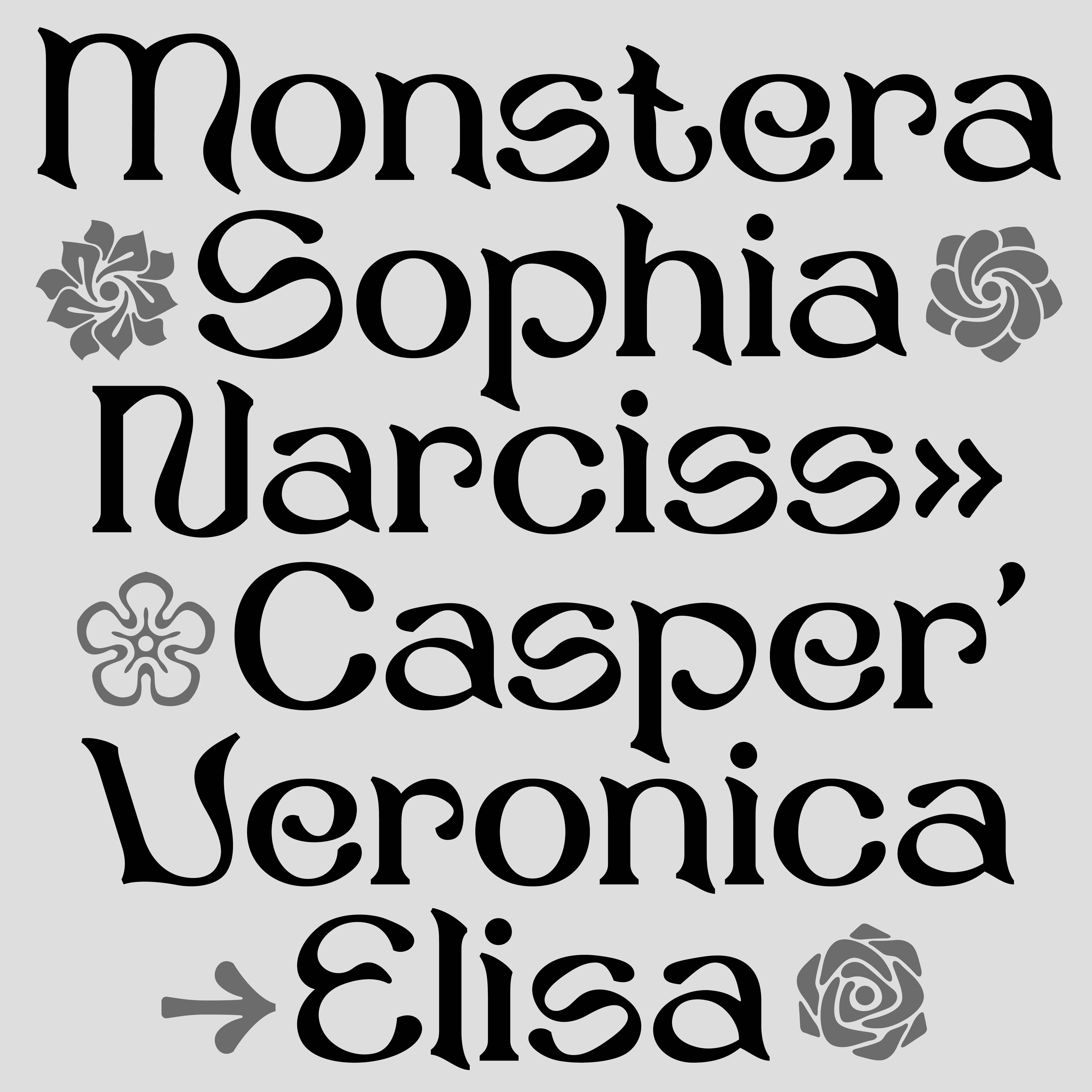
Mycela.otf
Oldenorth.otf
gruwel.otf
Hypermono
Muscular
Hackon
Saku
Mycela
Oldenorth
Gruwel
Graphics.roeleveld@gmail.com
︎
︎
All Rights Reserved 2025
Bastiro
Hypermono.otf︎
Facade.otf︎
Muscular.otf︎
Hackon.otf︎
Saku.otf︎
Mycela.otf︎
Oldenorth.otf︎
Gruwel.otf︎