Poster shop
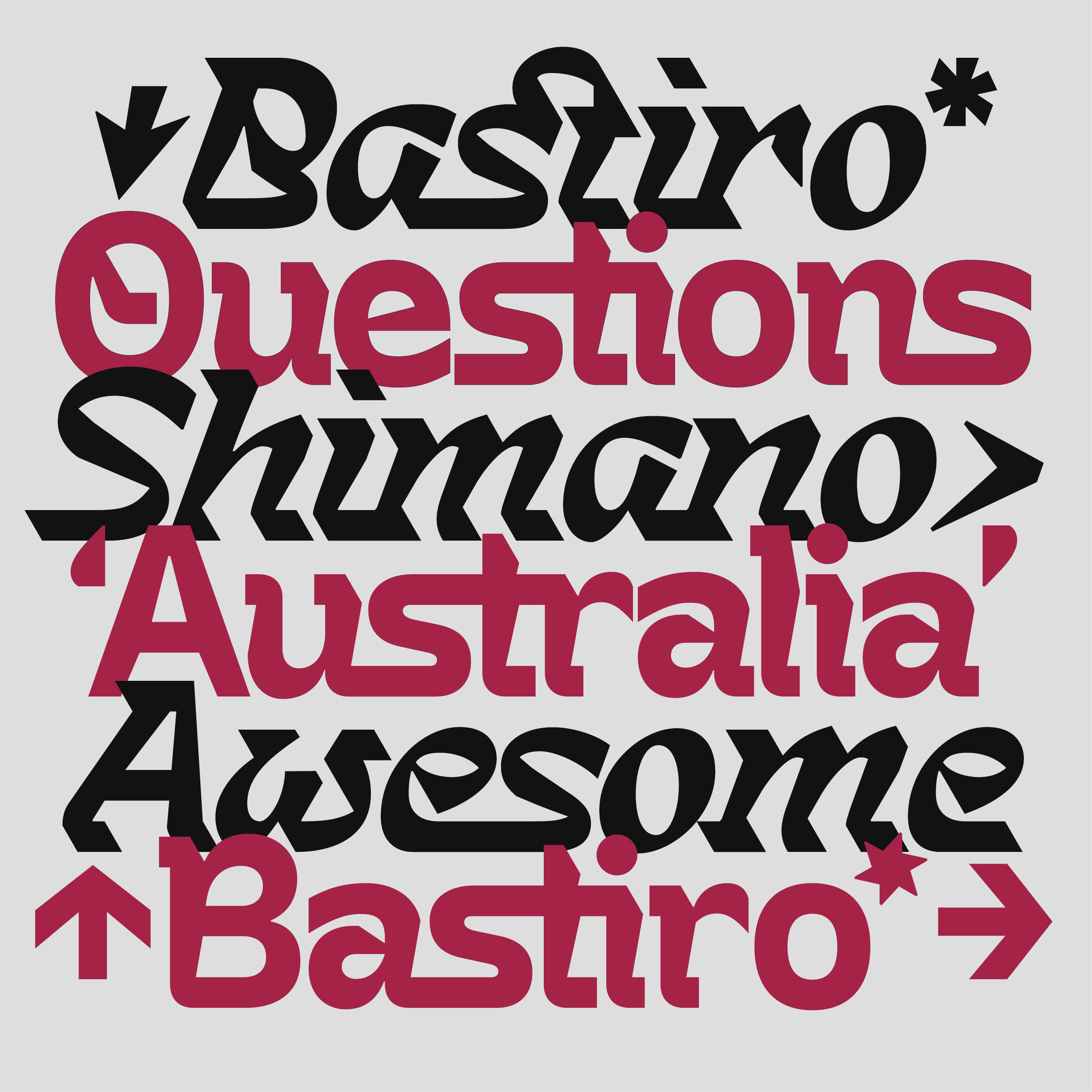
Bastiro typeface
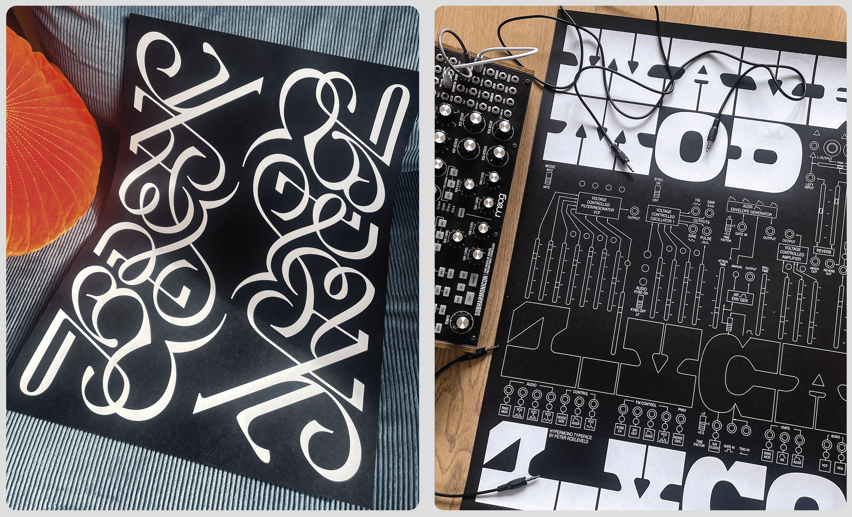
Hypermono typeface
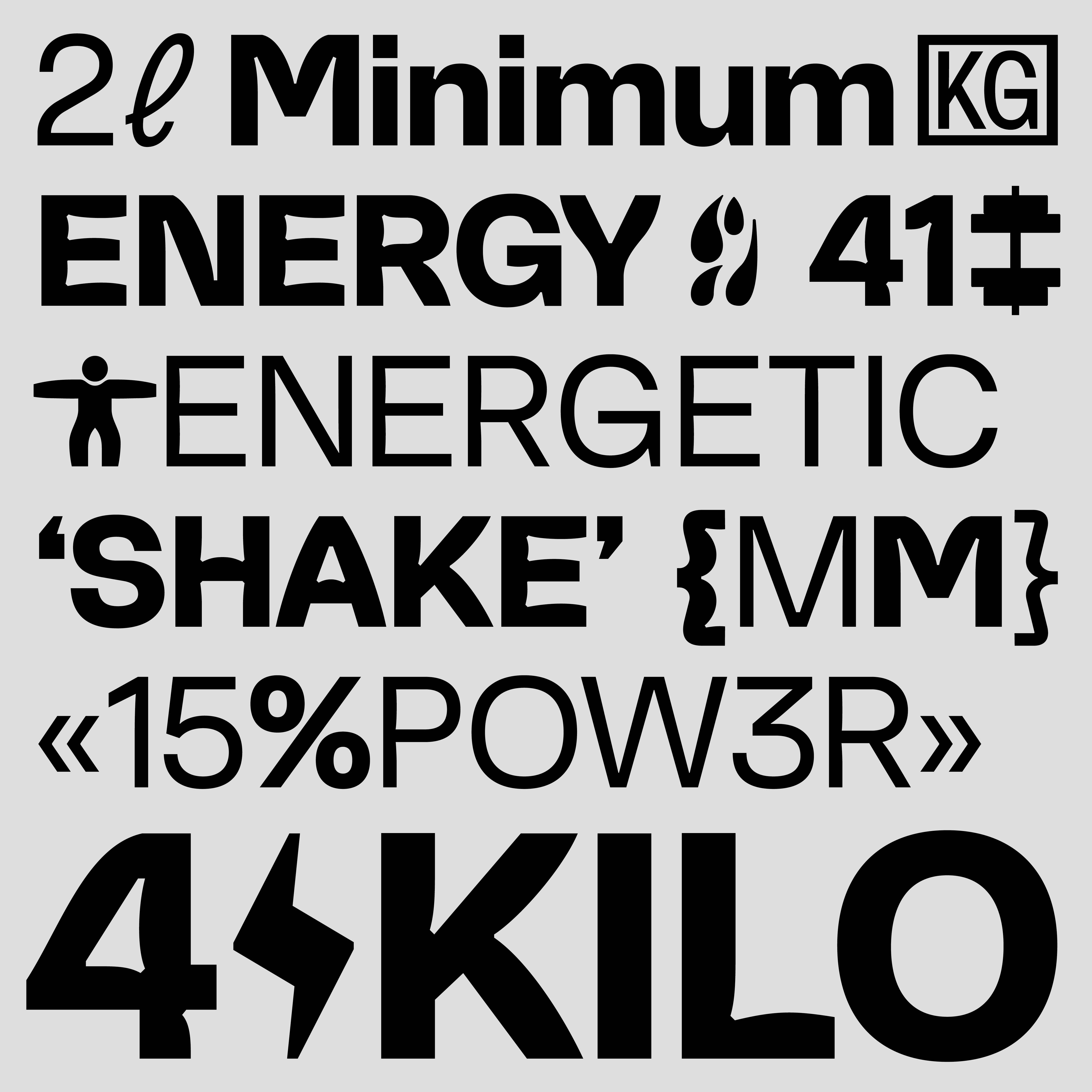
Muscular typeface
Hackon typeface
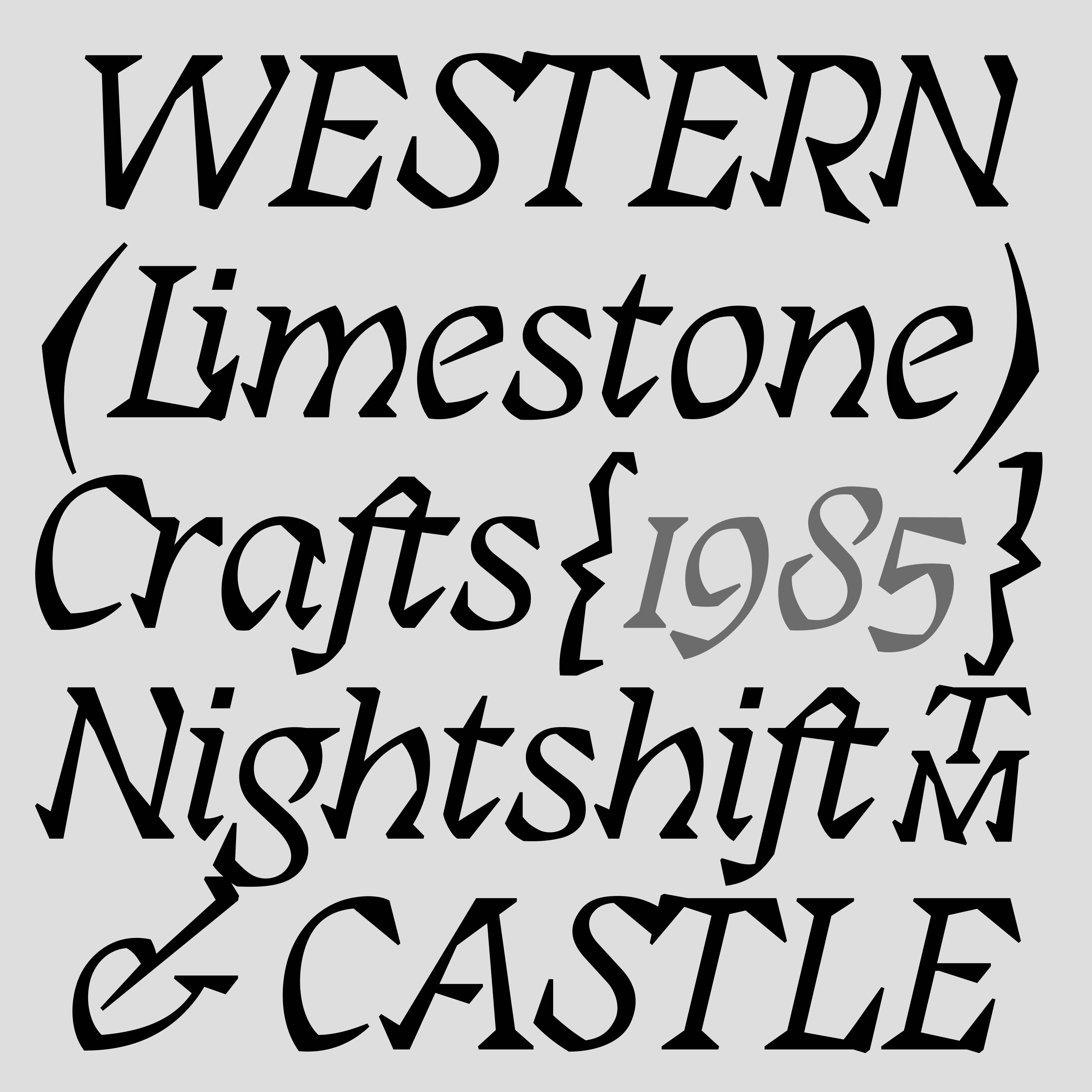
Saku typeface
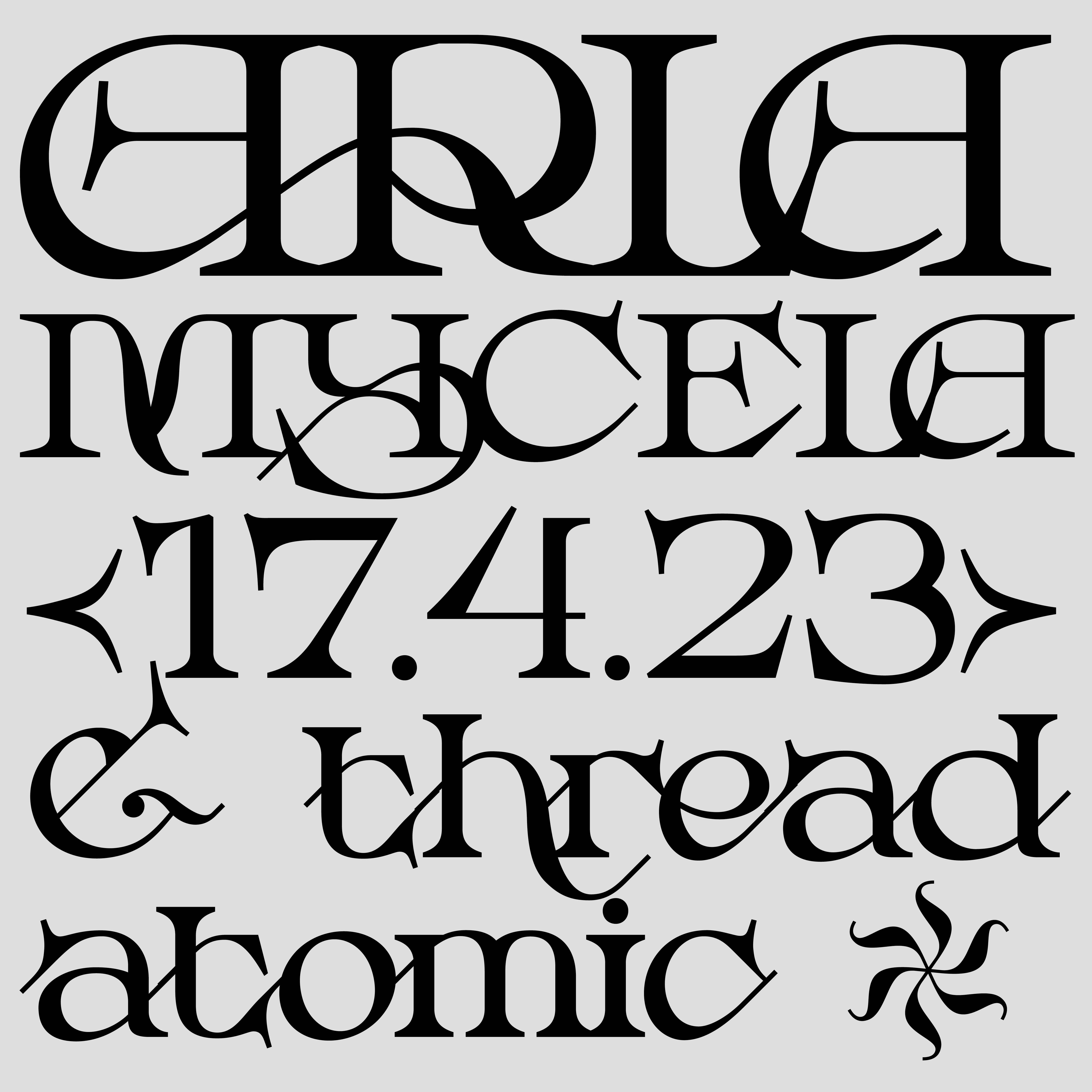
Mycela typeface
I am a type and graphic designer creating original typefaces, custom typographic logos, and identity systems. My work bridges traditional typography and experimental approaches, informed by physical materials, personal interests, and conceptual narratives.
Size
Height
Kerning
Continental™ tires
Size
Height
Kerning
ENVELOPE GENERATOR
Size
Height
Kerning
Structural type Made to endure
Size
Height
Kerning
Runes Carved In Forgotten Walls
Size
Height
Kerning
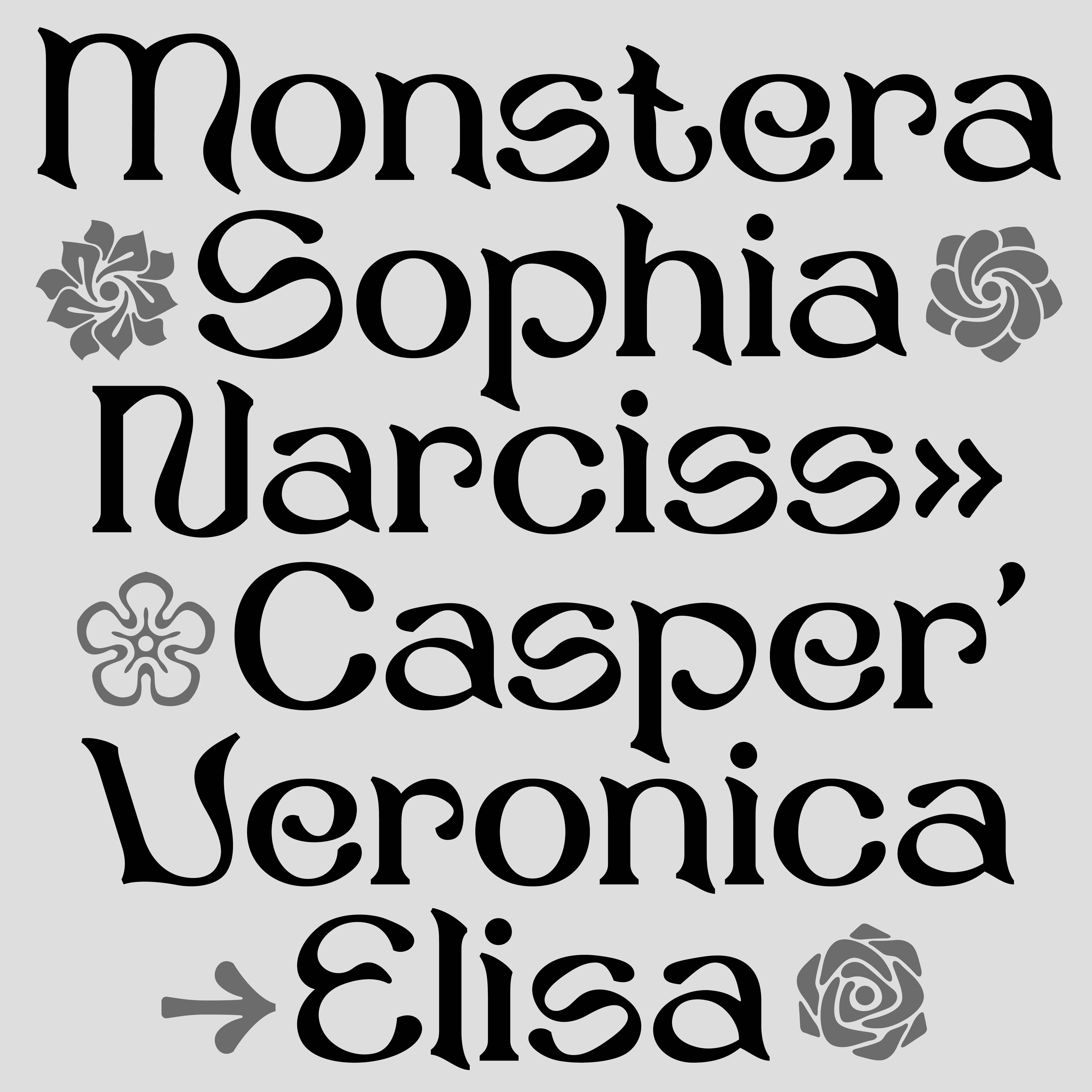
flower power
Size
Height
Kerning
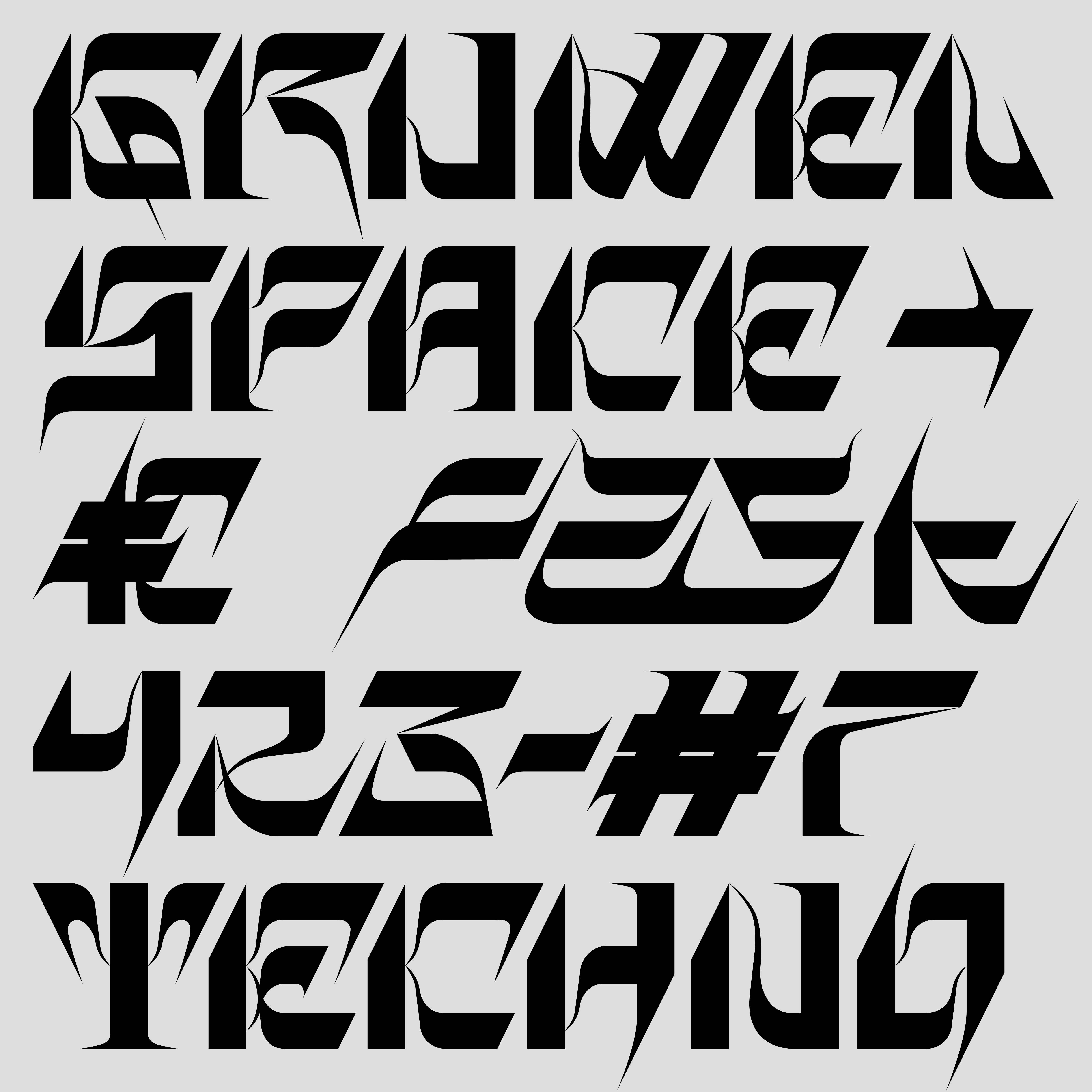
PATHWAYS EXPANSION
Size
Height
Kerning
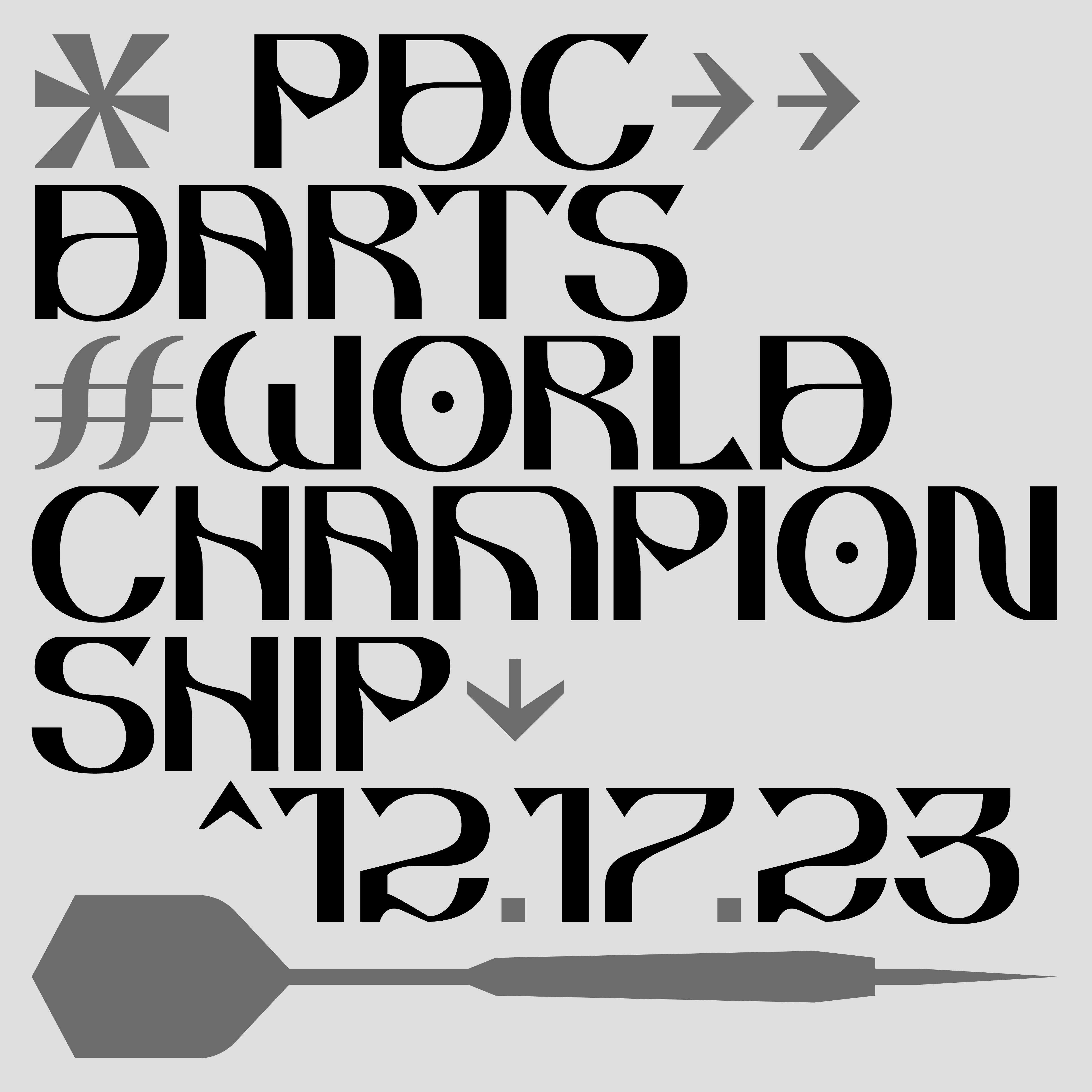
DARTS→WORLD #CHAMPION'26
Size
Height
Kerning
breakcore Production